Olympus SP-590 UZ Ultra Zoom DSLR Camera

Olympus has announced the new SP-590 Ultra Zoom digital camera with 26x optical zoom wide-angle. The 12-megapixel Olympus SP-590 Ultra Zoom offers a f2.8-5.0 with an equivalent 26-676mm focal length.
olympus-sp-590-uz-dlsr-camera
It features the image processor TruePic III, dual image stabilization, face detection and a 2.7-inch LCD screen HyperCrystal II.
olympus-sp-590-uz
You can also expect up to ISO 1600, 640 × 480 and video recording. Olympus SP-590UZ accepts MicroSD and xD-Picture cards. The Olympus SP-590 UZ will be available in March for about $ 449.99 USD.

dailydigitals.com
Read rest of entry

Daewoo Tablet C920 Mini PC

Daewoo release a new tablet mini PC C920 which looks like convertible netbook. It’s powered by Intel Atom N270 (1.6 GHz), 1GB of RAM, Intel 945 express chipset and 60GB of HDD (1.8-inch with 4200 rpm).
daewoo-c920-tablet-pc
The Daewoo C920 has 8.9-inch touch screen display with 1024×600 resolution and you can rotate it and use the pen. On the top of display you can find 1.3M pixel webcam and the weight is 1.21kg (include battery).
daewoo-lucoms-c920-mini-tablet-netbook
The dimension is 241.4×209.3×27.7mm but it sold with Windows XP Home edition which is not support tablet PC edition unless you install Windows 7 on Daewoo 920. The price is not available yet.
Read rest of entry

Dell Studio 14z Mobility Laptop

Dell release Studio 14z laptop for students and home users which is looks like netbook with battery life up to 6-hours and 30-minutes (8-cell battery) but the display has 14-inch LED.
dell-studio-14z-notebook
The Dell Studio 14z is a laptop for mobility and the design can reflect your personalize. It’s come with 6 different colors: red, yellow, black, blue, pink and brown. The Studio 14z powered by Intel Pentium Dual Core T4200 (2.0 GHz), Windows Vista Home premium edition SP1, memory 3GB DDR3, NVIDIA GeForce 9400M G and hard drive SATA from 250GB to 320GB.

dell-studio-14z-laptop
The LCD panel display of Dell 14z has 14-inch high definition 720p with TrueLife and camera/facial recognition software. The battery default using 54Whr Lithium Ion (6-cell) and you can upgrade to 8-cell battery. Another features like Dell wireless 1397 802.11 g half-mini card, and hifi sound 2.0

dailydigitals.com
Read rest of entry

No PC required: Brando SATA HDD adapter plays media straight out of the box

The Brando SATA HDD Multi-Media Player Adapter works with SATA hard drives, SDHC cards, an...

If you like your gadgets to be functional but without all that fussy “styling” or aesthetic design, the Brando SATA HDD Multi-Media Player Adapter may be for you. This no-frills adapter is literally a black box device that lets you play media files from a SATA hard disk, SDHC card, or USB storage device on your TV.

You can connect the SATA HDD Multi-Media Player Adapter to your computer (it works with both PCs and Macs) using USB 2.0, and then connect any 2.5 or 3.5-inch (6.4 or 8.9cm) SATA hard disk for data transfer, backup, and cloning. But the real value-added feature is that the device works as a standalone media player – no computer required.

The device connects to your TV with component, composite and HDMI interfaces. Once the unit is connected, you can use the included remote to control the built-in interface and play a variety of video and audio formats.

The SATA HDD Multi-Media Player Adapter may not have a sleek design or even a cool name, but if you are looking for a simple way to watch your media files on your TV, plus move some files around, this gizmo will get the job done. And for only USD$69, it just might be worth a look.

Specifications:

Video format: MPG / DAT, MPG, MPEG, VOB, AVI, MP4, DIVX
Audio formats: MP3, WAV, AAC, MPA, WMA, AC3
Image format: JPEG
Video output: composite (AV), component (YPbPr), HDMI (480i/576i/720P/1080i)
Audio output: CX/5.1CH

By Alan Brandon
Read rest of entry

Media streamers – the future of home entertainment


Western Digital WDTV

The last 12 months have seen a swathe of new technologies and devices emerge that threaten to change the face of home entertainment forever. There can be little doubt that digital audio formats and portable players have changed the way we listen to music, and in a similar way, digital video could soon consign drawers filled with DVDs to the proverbial scrap-heap.

In the not too distant future, the most essential set-top box for the modern home will not be the Blu-ray player, freeview box or even a satellite or cable receiver, but the home media streamer. While still at a relatively early stage of development, a streamer offers a similar service to the humble MP3 player in its ability to support playback of digital media formats, most notably video.

So what exactly do these devices do, and why are they so special? Well, as is usually the case with new technology, streamers come in various shapes and sizes and vary quite wildly in the specific features they offer. Predominantly, a streamer’s job is to transmit digital video files across a network from a library stored on a computer to a television. Exactly how adept they are at doing this and what else they can offer the home user is what separates the men from the boys in this market, so we’ll take a look at five boxes that should be ticked in a successful, versatile device.

Connectivity: Most modern streamers now offer all-important HDMI connectivity, with some sporting version 1.3, though you’ll often find older standards included such as component, composite and digital audio connections.
File support: This is one area that varies quite wildly and the wide range of file formats and codecs currently doing the rounds means that versatility is paramount if an entire library is to be supported.
Network support: All streamers offer an Ethernet port for connection to a network but any that are worth their salt also offer wireless, with 802.11n seeing increased support. This is essential for hassle-free operation and in the case of the latest standards, is important to guarantee that high-resolution files will stream smoothly.
Usability: A well-supported, versatile streamer is of little use if you can’t find your way around the features and browse a library of files comfortably. A streamer should offer customizable, intuitive menus, good media control, quick and easy network setup and a decent, responsive remote control that doesn’t leave you hammering away at buttons for a reaction or squinting down at a mass of options for the desired control.
Support for online services: Perhaps the biggest thing holding streamers back is availability of content. Subscription or pay-to-view services like NetFlix [http://www.gizmag.com/lg-bd30-network-blu-ray-disc-player-with-netflix-streaming/9740/] and its 12,000-strong library, Blockbuster’s recent agreement with Tivo (http://www.engadget.com/2009/03/25/blockbuster-ondemand-comes-to-tivo-tivos-going-on-sale-at-bloc/) to supply digital downloads and improved access to sites like YouTube will drive the market forwards. Finding a suitable way to expand this support in a way that benefits both the consumer and the provider is essential to the future of home entertainment.
Jukeboxes, games consoles and web-enabled TVs

If the conventional media streamer seems like a rather expensive investment at this early stage, there are cheaper alternatives that offer direct access to media files through a TV using locally stored libraries. More accurately described as ‘media jukeboxes’, these devices often come with built-in hard drives for storing a media library or in the case of the excellent Western Digital WDTV, offer quick access to connected USB storage. Jukeboxes are often cheaper and a better option for occasional users, allowing instant playback of digital video, photos and music files through a TV.

In addition to this, HDTVs are starting to offer support for digital video formats and built-in wireless to stream files across a network and view online content. Games consoles are improving support and even Blu-ray is getting involved so if there is any doubting the potential of this technology, these developments should put them to rest.

By Paul Lester
Read rest of entry

Joomla! Creating and Editing Custom Templates: Template Manager

By Jen Kramer McKibben

Custom templates are the key to making a Joomla!-driven website stand out. In Joomla! Creating and Editing Custom Templates, Jen Kramer McKibben offers instruction and insight to help Joomla! users create eye-popping websites. Jen starts with the basics, like how to add the Joomla! template codes to a static HTML layout, install the template package, and clean up styling after installation. She also shows how to make multiple layouts within the same Joomla! template, configure menus and submenus, and more.

In this video, host Jen Kramber McKibben goes into the Template manager in Joomla and specifies that we are at the point where we need to create the thumbnail so when people mouse over the name that they will also see the same shortcuts. She shows how to create the thumbnail in Dreamweaver, put the screenshot she grabbed into Fireworks (or another image editor) to crop it and make it smaller.

Template Manager

CLICK HERE Template Manager
Read rest of entry

User feedback drives five principles for multimedia news on the Web

By Peter Schumacher

Interactive multimedia features can be challenging for users: Where do I have to click? How do I stop and restart this animation? What navigation options do I have? Multimedia content producers should take a look at their work from a user's perspective.

How do users interact with interactive multimedia infographics? How do they scan, browse, read and interpret them? And what do these experiences mean for journalists and designers producing multimodal news presentations for the Web? We wanted to answer these questions.

With a user-centered approach, we tested interactive graphics covering the tsunami disaster in Asia. The graphics in the sample were produced in Flash and published by nytimes.com, bbc.co.uk, Spanish elmundo.es and German zdf.de. The test series was held in February 2005 in the media reception lab of the University of Trier (Germany) with 15 subjects, all students (average age: 23.1 years). The tested graphics were shown in different combinations and sequences. Usually each subject was confronted with two different graphics.

We applied methods from usability testing to capture the subjects' responses. For each stimulus, eye tracking was followed by a thinking aloud sequence. For the eye tracking an IView-X System from SMI was used, a corneal reflection system with a sampling rate of 60 hertz.

Our findings produced practical hints on how to create better interactive graphics, bearing in mind users' expectations, behavior and reception strategies.

These are five principles that producers and journalists should seek to follow:


Principle 1: Avoid an information overload

Combinations of text and visualizations always risk providing more information than users can cognitively process in an organized way. But producers are tempted to put as much of their material as possible into a single feature: extensive photo galleries, timelines with full agency reporting on the different stages of an event, multilayer maps, eye witnesses reports in picture and audio.

From a user perspective, interacting with such a packed multimedia feature means solving various tasks, often simultaneously.

  • Finding, understanding and interacting with the navigation options (including internal links inside the feature)
  • Getting an overview on every page and an orientation of the user's actual position inside the feature.
  • Interpreting information from various presentation modes (text, graphic, photo and animation) and integrating them into a coherent mental representation.

This bundle of tasks -- some of them operational, some of them content-orientated -- is often more than the user can handle. Sometimes users won't find all of the navigation options. Or they ignore parts of the content. And sometimes the overload can lead to irritation, disorientation and finally to a drop-out.

Graphic

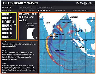
Example 1 (from nytimes.com): The timeline navigation bar (here highlighted in yellow on the left) controlled three content areas (orange). Users’ attention jumped between the map and the navigation bar. The text in the news ticker got no attention; the wave height was ignored by almost every user.

Principle 2: Have users' expectations concerning interaction functionality in mind

Users tend to interpret any salient graphical element as clickable. That presents a problem for producers and designers, who may want to decorate or fill space.

In text-dominated forms the standards for hyperlinks are widely accepted: Links are underlined or in a different color or both. But standards are still developing for interactive graphics. Currently, links can hide behind every element: Buttons, legends, keys, points on a map, words.

Many producers try to establish consistency by using similar marks for clickable points and standardized navigation systems. This helps users, especially frequent ones. Nevertheless, the only way many users explore interactive graphics is with an extensive trial and error mouse excursion.

Graphic

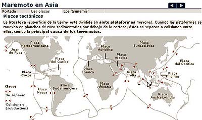
Example 2 (from elmundo.es): Test subjects clicked on salient elements -- in this case the box marking the epicenter and the red arrows -- expecting either to get a close-up or further explanation. In fact, there was no navigational option within this screen.


Principle 3: Be careful using animation

Animation tends to attract (or distract) users. Blinking, flashing or fading arrows, dots and circles are guaranteed magnets for attention and clicks. If there is text competing with animation, the text will lose.

Animation will also raise expectations of functionality, as in the example below.

Graphic

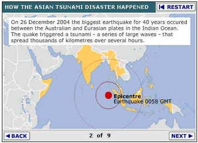
Example 3 (from bbc.co.uk): The flashing red dot marking the epicenter distracted readers' attention from the text and it encouraged users to click on it (and in this case it is not clickable).

Producers should make sure that users do not click in vain on elements with animation. Give users functionality.

When using animation it also might seem necessary to add some explanatory text or legends. But users can have trouble integrating that information when an infinite animation loop is grabbing attention. It can be helpful to let users start and restart the animation, which leads to the next principle.


Principle 4: Let users fully control the interaction

If using video, audio or animation, give users clearly marked buttons to start, stop and restart. When using online media, users are not in a lean-back position as when watching TV or listening to the radio. Interactivity and non-linearity are characteristics of Web-based media that users expect.

Be careful with automatically starting multimedia or audio sequences. Anyone who has ever been surprised by an unexpected video or sound when entering a website knows the experience of frantically searching for the off button, or just leaving the page by clicking the browser's back button. Users, of course, have the same experience. So producers should clearly mark when a click starts an animation, video or sound, and clearly mark how to stop.

Giving users control over their interaction requires a navigation system that allows orientation within the graphic. That includes a clearly marked "home" button. Users tend to see Flash graphics as an independent website, regardless of whether the images are integrated in a page or are separate in a pop-up window.


Principle 5: Involve users in testing your graphics

It's the usability, stupid. Ask a sample of typical users to click through the graphic and to comment spontaneously on it. Watch carefully, ask for their navigation strategies and expectations, take notes. Even with just three or four users testing the site, you will find elements that are unexpectedly problematic for users. This simplified think-aloud test and other methods from usability testing have proved useful for evaluating interactive and multimedia presentations -- and for identifying user needs.

Why is a user-oriented perspective helpful? Newspaper design and presentation have been ingrained by decades of use. But design standards for online news sites have changed in just a few years. Users and producers have developed expectations about positions of home buttons, navigation bars and link labeling. Interactive graphics are still in an early stage of this evolution. Integrating animations, text and audio in a user-controlled system is still a challenge, especially when it comes to telling a coherent, navigable news story. And technology is evolving fast: the shift to broadband access allows producers to integrate heavier multimedia content and to create new forms of presentation.

Although the interactive news business is still experimenting with that, standards are rising. Our analysis of the interactives produced by the leading news sites found some trends: these sites have set up their own standards for interactive news presentation. They tend to differ between the sites, but not that much. Top navigation bars are widely used, sometimes combined with a browser-like linear back-and-forth navigation.

Links to the tested graphics

nytimes.com: Asia's deadly waves

bbc.co.uk: The tsunami desaster explained

elmundo.es: Asia bajo el tsunami

zdf.de: Flutkatastrophe in Asien


Read rest of entry
 

My Blog List

Followers

Multimedia & IT Copyright © 2009 Gadget Blog is Designed by Ipietoon Sponsored by Online Business Journal